 I was talking to a friend a few months ago and she told me that the dirtiest part of her house was the one place everyone saw when they came to her house. This was true even if they never came inside, because that spot was the entryway. It dawned on me that a messy entryway is pretty much a fact for most busy families, and it was then that I planned my spring refresh with new entryway decor.
Entryways: the most overworked area of a home
I’ve never loved our entryway. It’s basically an area slightly wider than a hallway that curves around and leads to the main part of the house. Our entryway is not spacious enough to do anything really exciting, and it really has to handle a large amount of traffic and an enormous amount of stuff each day. Sadly, it’s by far and away our most underwhelming area of our home.
A few years ago we started on our entryway wall with our mywoodwall DIY project, and it’s been the one saving grace of the area. Having the DIY wood wall made it look updated even though our entryway is rather small and uninviting. But, unfortunately, it also brought to your attention how the rest of the space could definitely use a refresh.
Side note: Isn’t the wood wall adorable? We still get so many compliments on it every time someone new comes over.
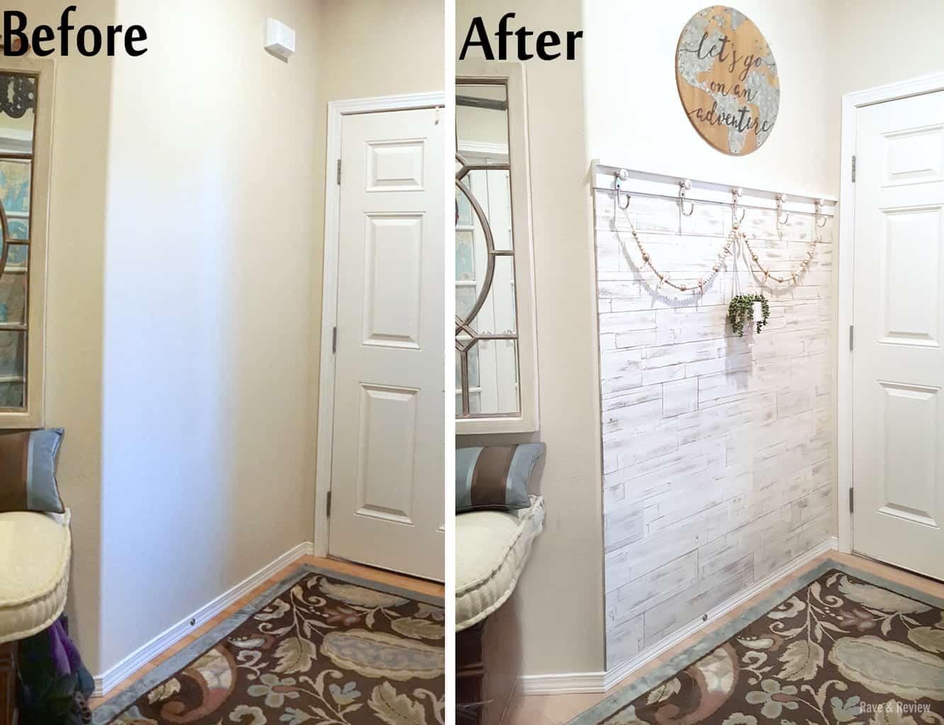 Dated and in need of a spring refresh
That area may look nice, but that was the only thing going for the space. The other side of the entryway {the *ahem* more visible side} holds a mishmash of items. To the side of the door is a cheap shoe organizer, which is functional but not pretty. An old flip top desk we bought at Value Village for $7 a few years back sits between the bathroom and hall closet. And, some antique frames that were meant to hold masterpieces the kids brought in are hanging over the desk. In theory the setup is great, but somehow it all collects clutter. 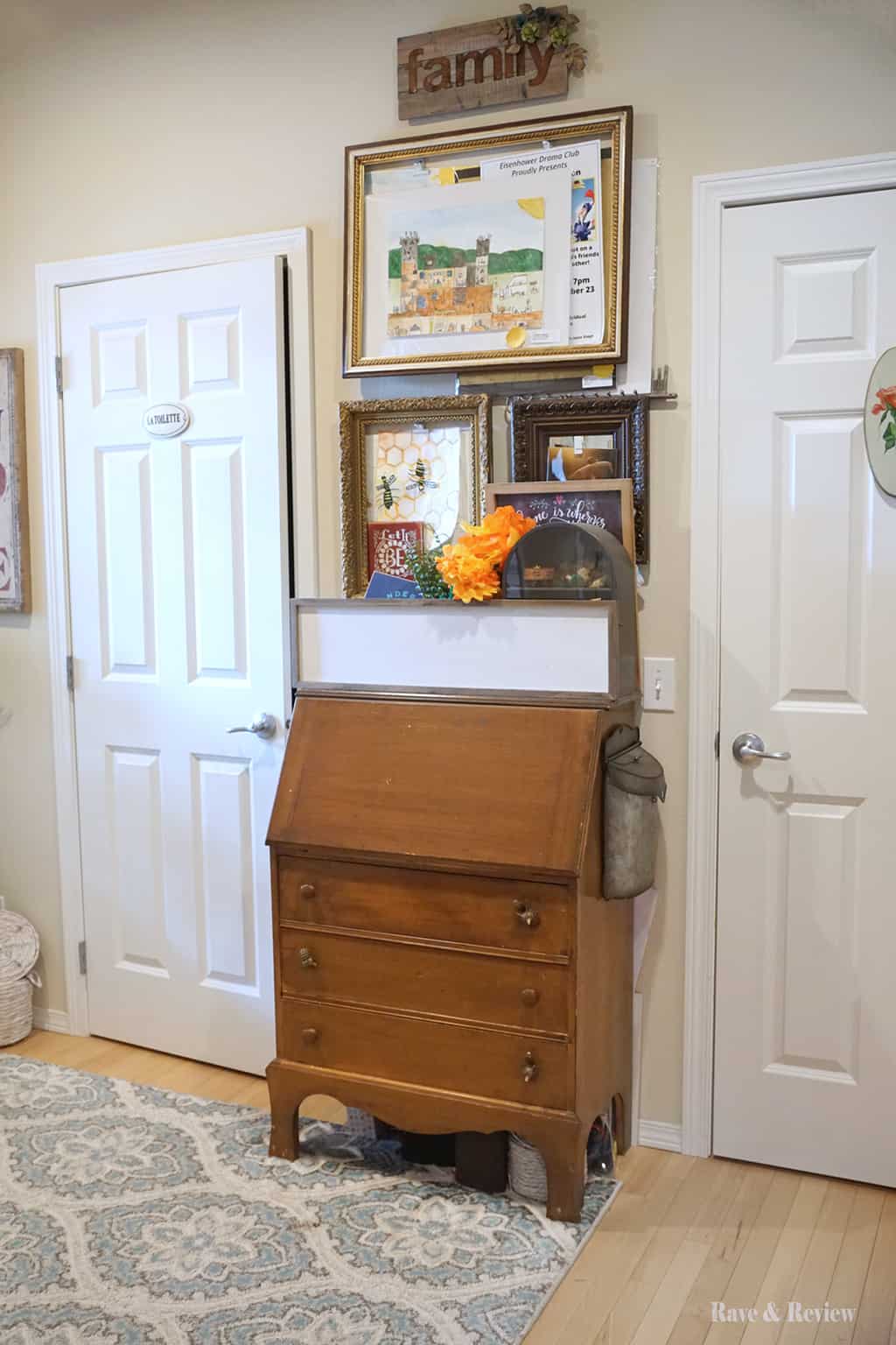
It was all in need of a refresh, starting with the flip top desk. The flip top desk is in that grey area between antique and just dated. Recently, my feelings have been leaning more towards dated. Basically, it’s not quite old enough to look like an antique, but definitely has enough years under its belt to actually *be* an antique.
I dreamed of one day painting that desk, but wasn’t sure what color to go with. So, my daughter and I started with the color of the rug we added about a year ago and then I made my own chalk paint to cover the desk. 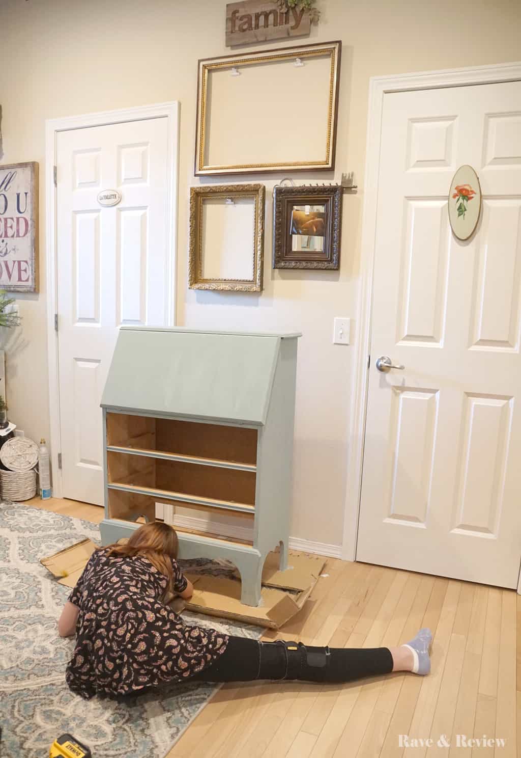 Next, I needed to take down the artwork display. Although it is in theory the antique hanging frames a nice idea, it just can’t handle our influx of art. Maybe we’ll return to a version of it later, but our entryway needs to be cleaner and more serene, and that means losing the piles of artwork.
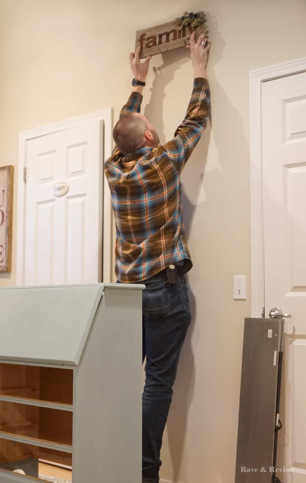
Spring refresh: New entryway decor shelves from Cost Plus World Market
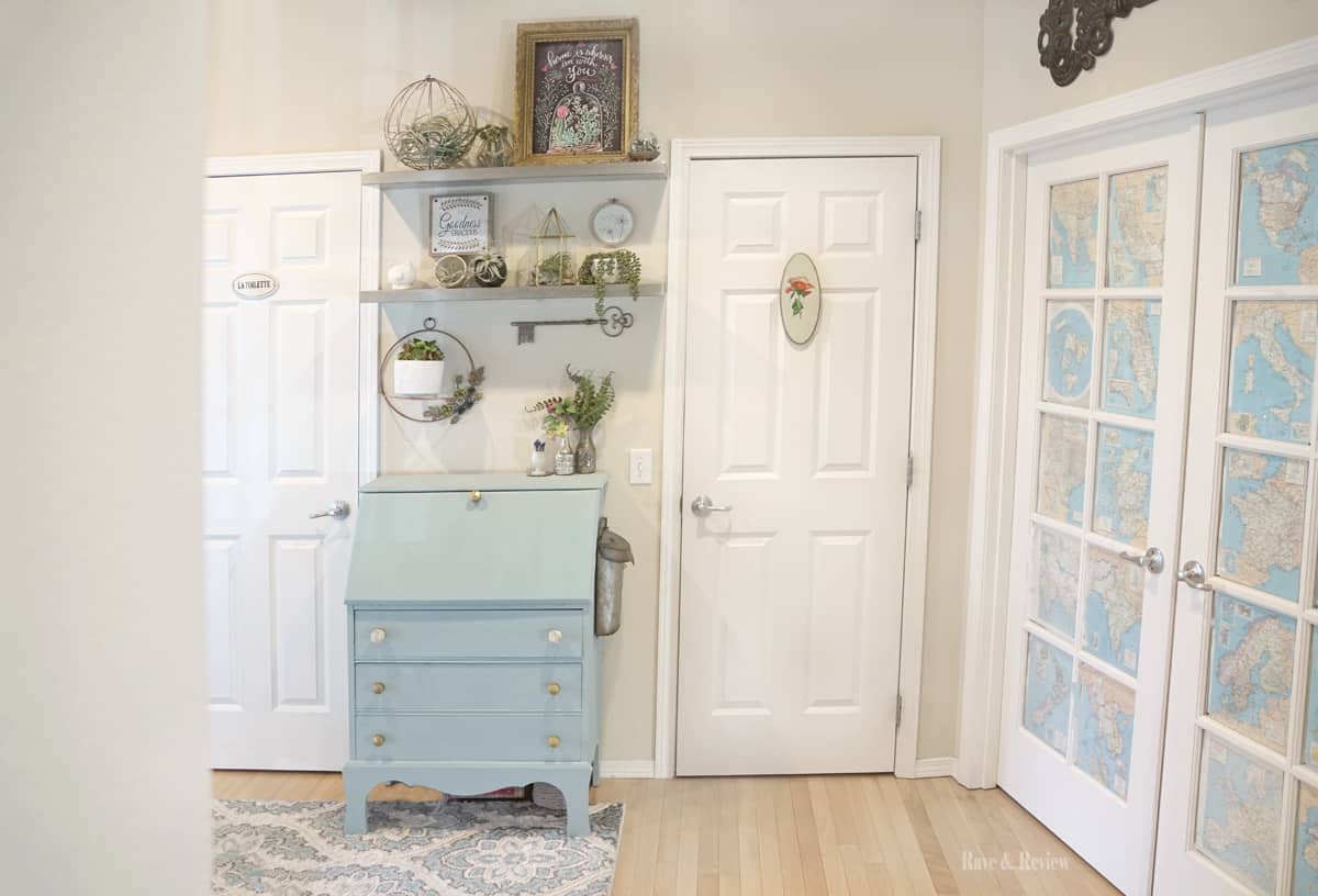
I had these two metal shelves from Cost Plus World Market that I thought would be perfect for our bathroom redo. Unfortunately, they were a 1/2″ too wide and because they are metal, they can’t be cut down. But, wanna know where they fit *perfectly*? That’s right, they fit like built-ins right in the space above the desk we were re-doing. 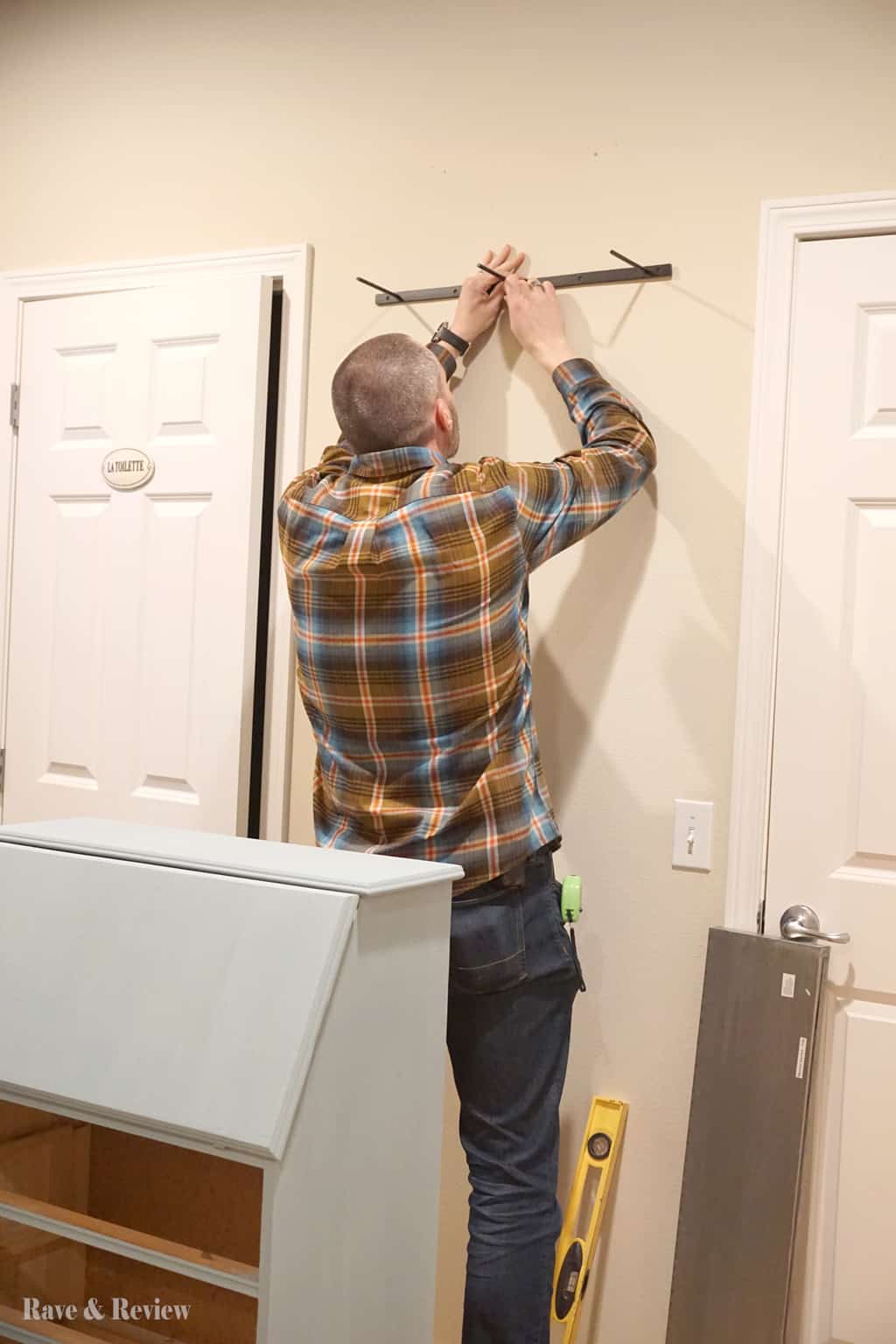 The entire time we hung the shelves I was just holding my breath hoping that the shelves looked okay in the space. My biggest concern was that when you came out of the bathroom on the left they might feel like they were coming right at you. But, once they were up I was in love when I realized how great they looked. And, it turns out they don’t feel like they are coming out at you when the desk is there as well.
Now that paint was dry, the shelves were hung, and it was starting to come together, I was ready for the fun part. Accessorizing the space was all that remained, and I couldn’t wait. 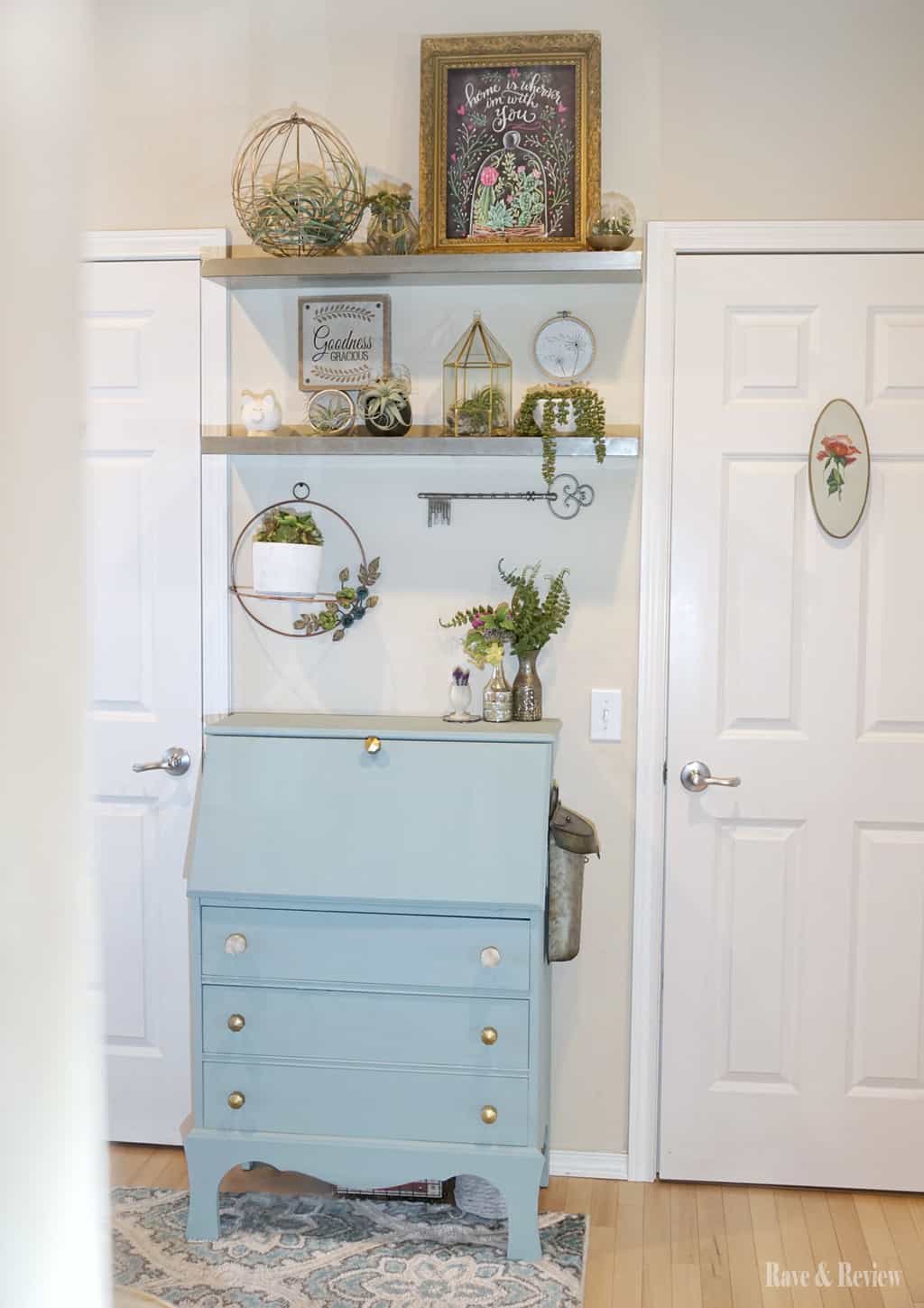
Spring refresh with new entryway decor
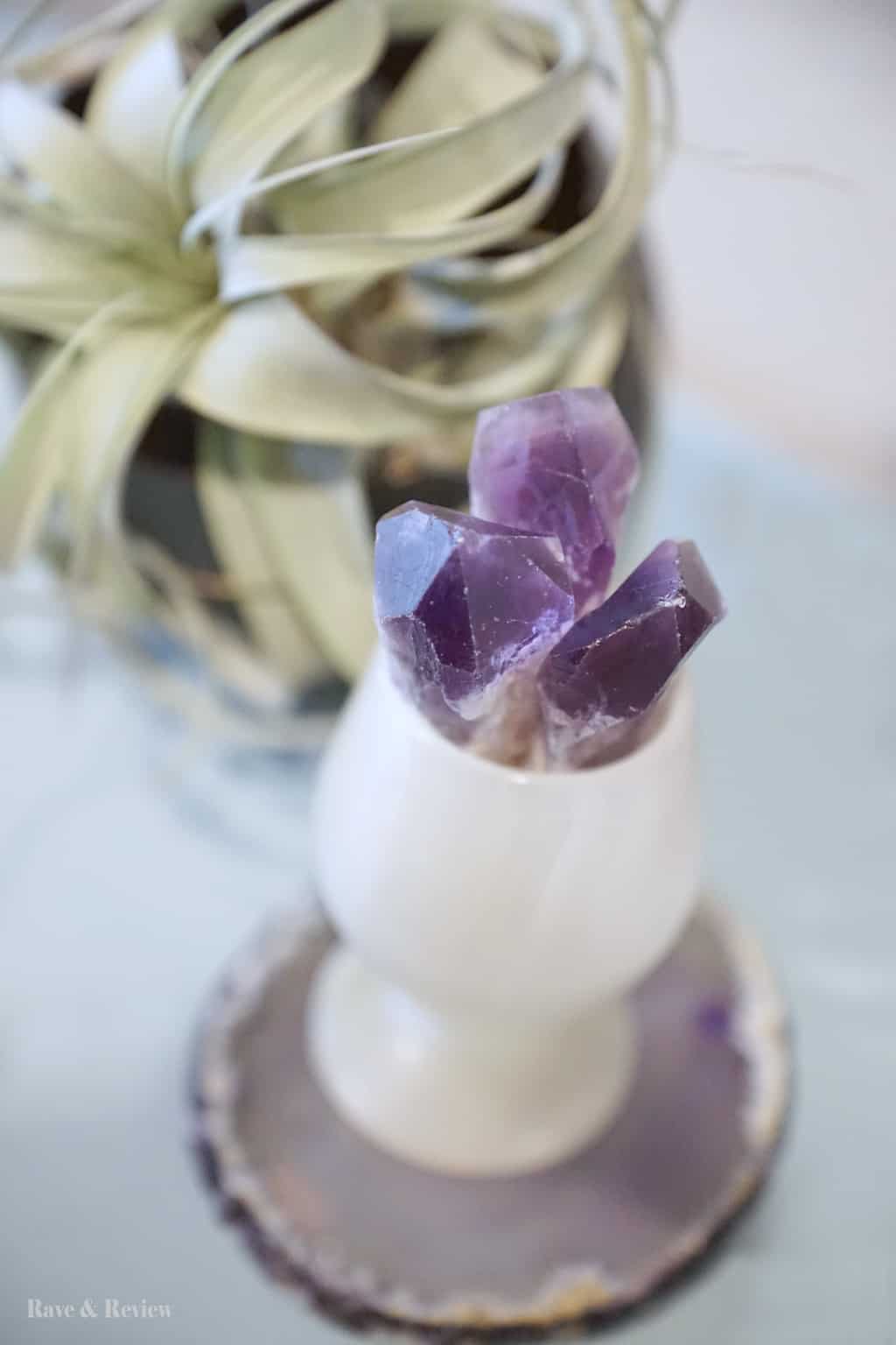
All of my décor had to be pulled from other rooms since I can’t go shopping right now, but I’m still incredibly happy with the look. Thank goodness I’ve never had a lack of décor lying around. Collecting cool objects when we explore is one of my biggest clutter problems, and I’m trying to get better about how many new items come in. It ended up being enmormously fun shopping my home for this new display area. I love that I got to display items that weren’t shining elsewhere, and now they really stand out. 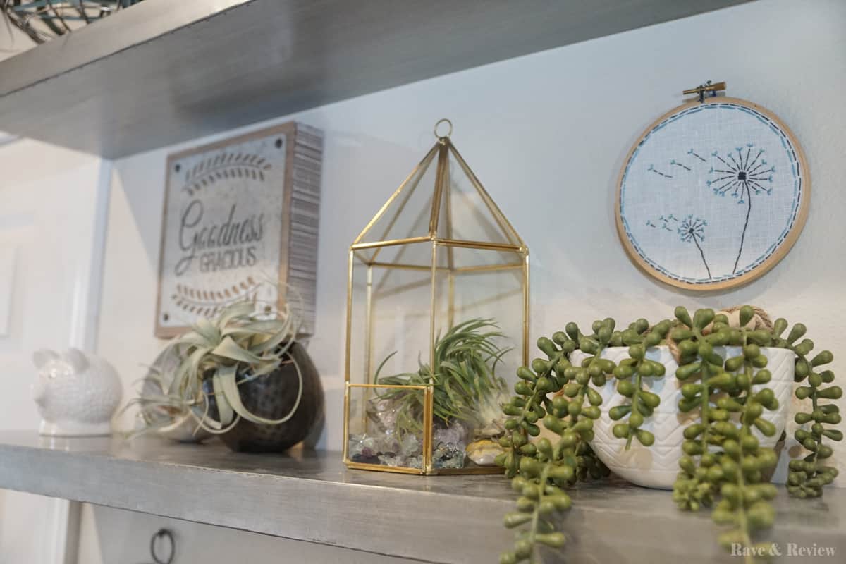
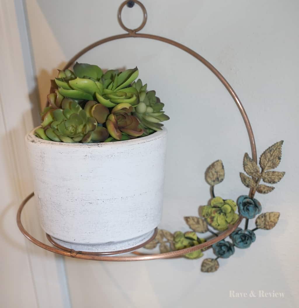
The theme and décor will probably change a few times each year, but I am loving how bright and airy the new shelves look. I made a few of the items, upcycled what I could {notice the old frame from the entryway is now holding this print?}, and I pulled things together with a loose “spring” theme. 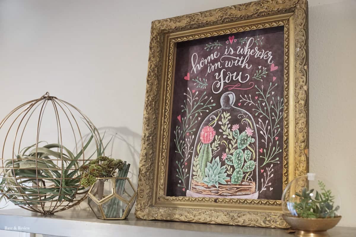
As much as I love the shelves, I adore the new freshly painted desk as well. I was meh about the desk for the past few years, but hesitant to actually put paint to wood. Now I see how goofy that is, because the desk that was worth $7 before could easily be sold in a shop in Snohomish for $90 – $100. I’m going to call this a big huge win. 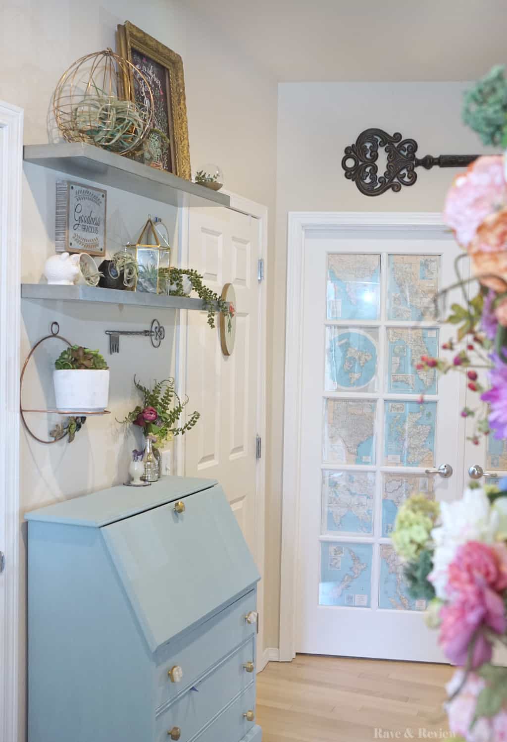 A bonus is that the newly painted desk looks great with the maps on our office door. When I was mixing my paint the office doors weren’t really on my list of considerations. But, surprisingly the new paint ended up making the office doors look refreshed and new as well. Go figure.
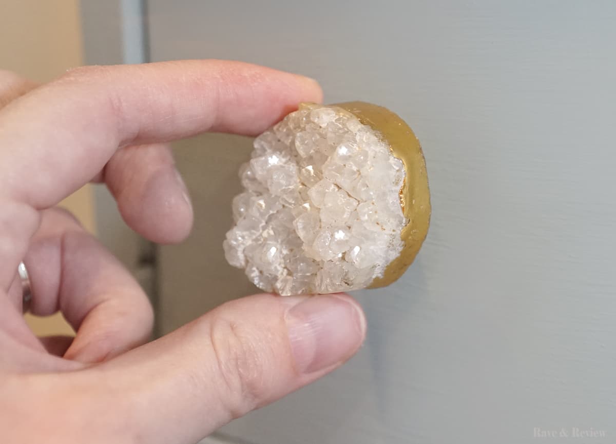
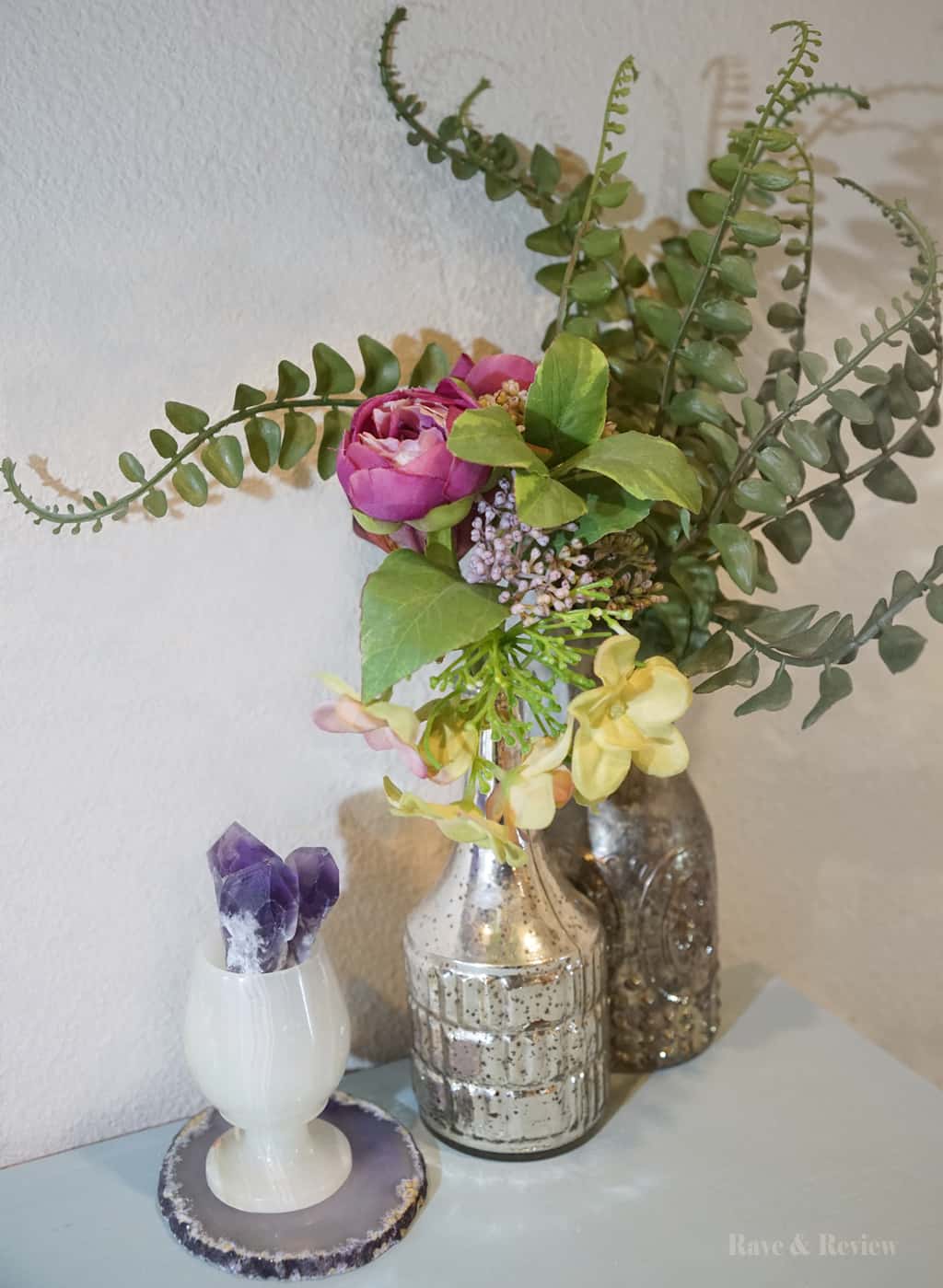
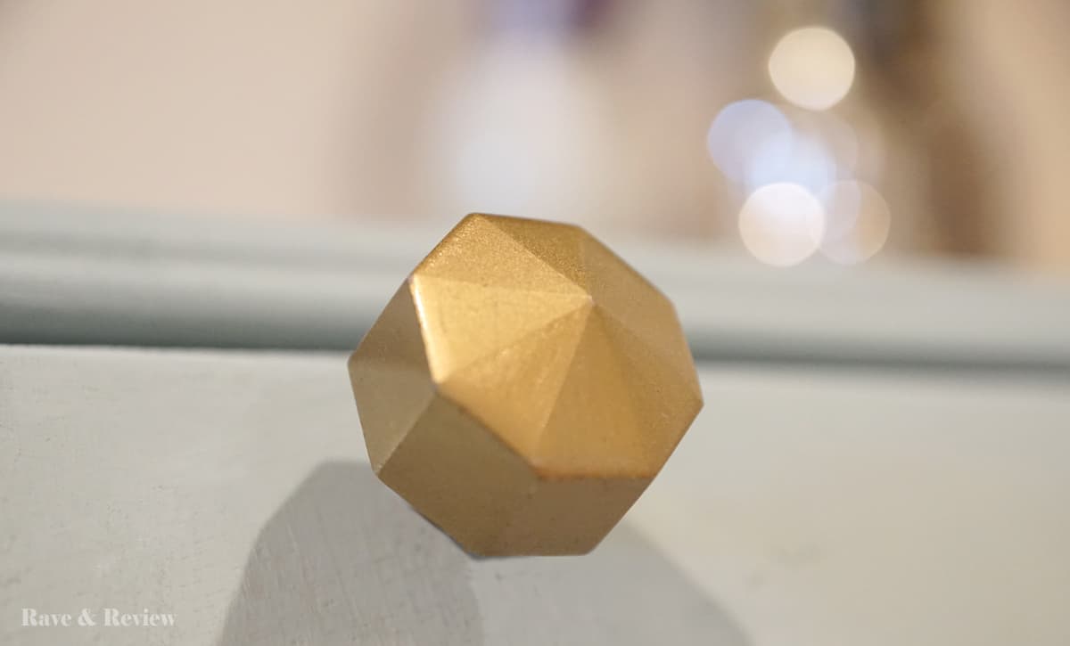
A look at some of the spring refresh entryway decor:
